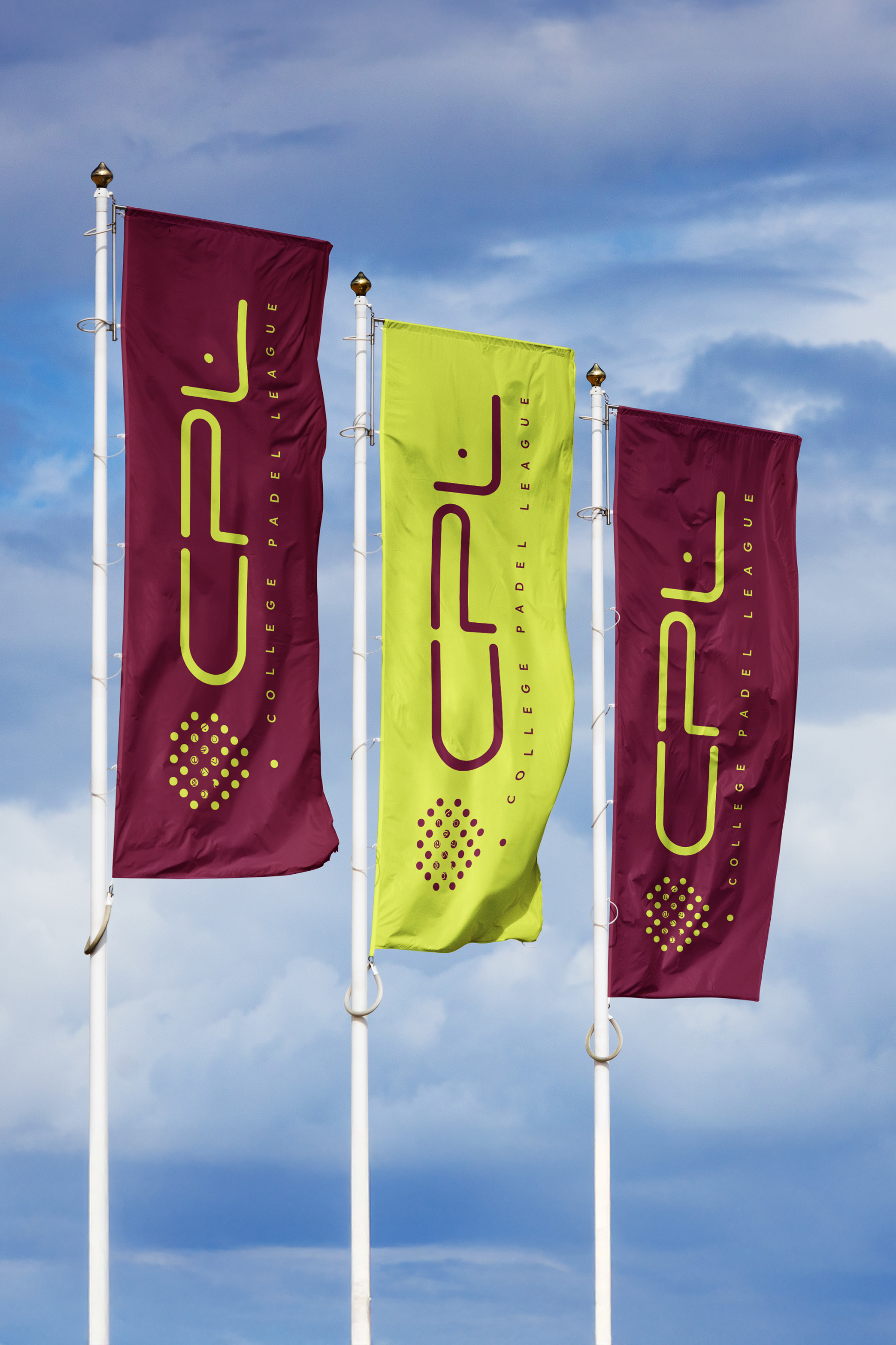
FROM CAMPUS TO COMPETITION
Creating the brand for the world’s first college padel league
The College Padel League was created with a bold vision: to launch the world's first dedicated collegiate padel competition in the United States before expanding internationally.
Unlike a traditional sports brand, CPL was founded by a collective of leading operators and investors, each with their own identity and ambitions within the sport. The league would also exist alongside universities with established traditions, colours, and visual identities.
The challenge was to create a brand that could unite these stakeholders under one system while building a distinctive identity capable of becoming the future home of collegiate padel.
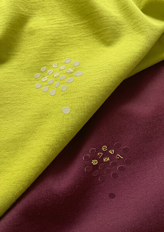
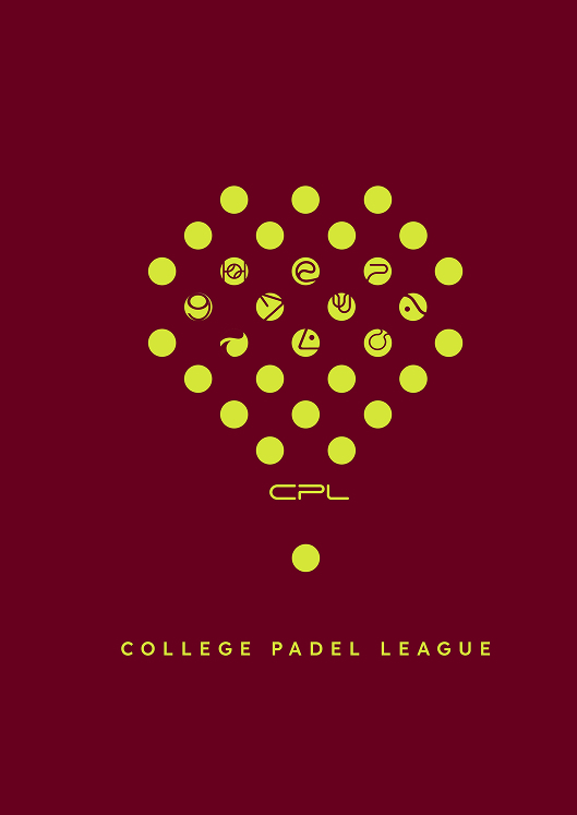
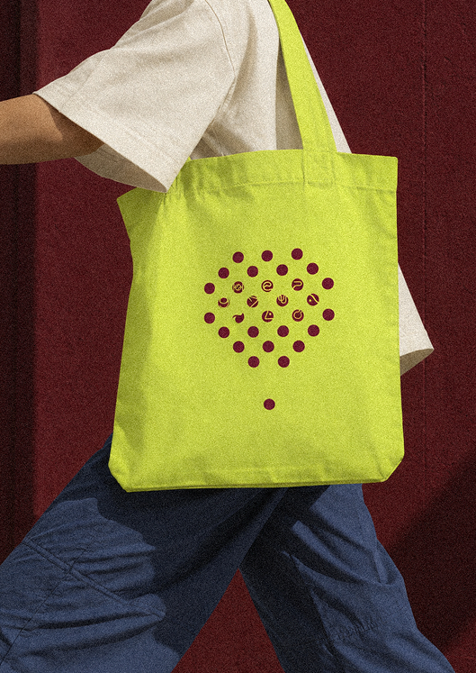
Rather than focusing solely on the sport, we focused on the people and organisations behind the league.
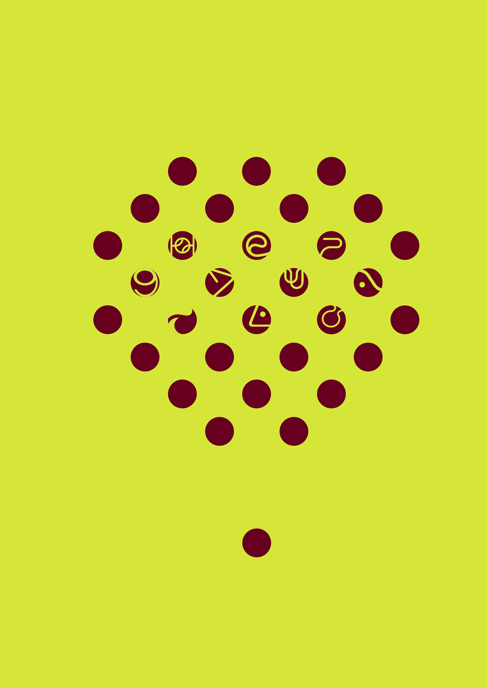
This led to the creation of "The Ten"; a symbol inspired by CPL's founding stakeholders. Individual forms come together within a single structure, representing unity, collaboration, and a shared commitment to growing the game.
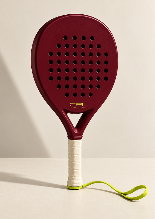
The icon also draws from the diamond shape of a power racket, one of padel's most performance-driven racket profiles. Its upward geometry reflects ambition and progression, while the intersecting forms represent multiple forces converging into one system.
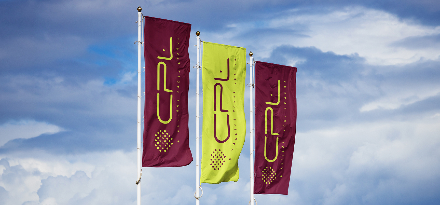
To support this positioning, we developed a visual identity inspired by collegiate sports heritage. A rich burgundy anchors the palette, drawing on the prestige and tradition of academia, while vibrant accents introduce the energy and optimism of a new generation of athletes.
The result is an identity designed to feel equally at home on a university campus, a professional broadcast, or the league's future international expansion.
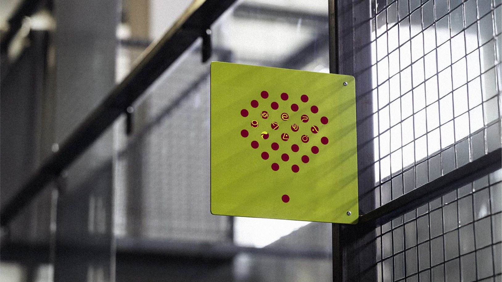
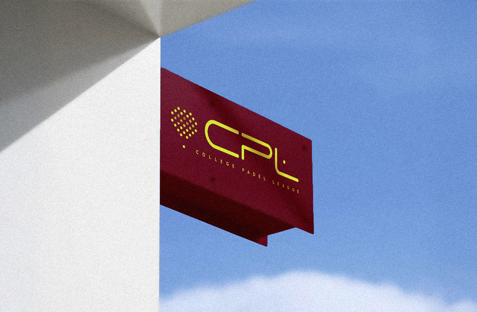
That thinking informed the structure of the mark itself. Strong diagonals drive the forms upward and inward, creating a sense of momentum while bringing multiple elements together into one unified symbol. The intersecting geometry represents the founding organisations behind CPL, while the upward trajectory reflects the ambition of the league and the athletes competing within it.
Rather than illustrating a racket literally, we extracted its most recognisable structural cues to create something more ownable: a sharp, compact symbol that feels inherently connected to padel while carrying the authority of an established collegiate sports mark.

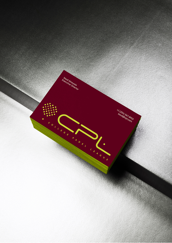
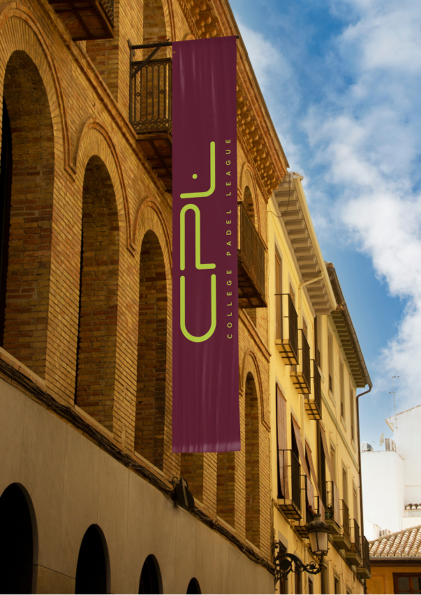
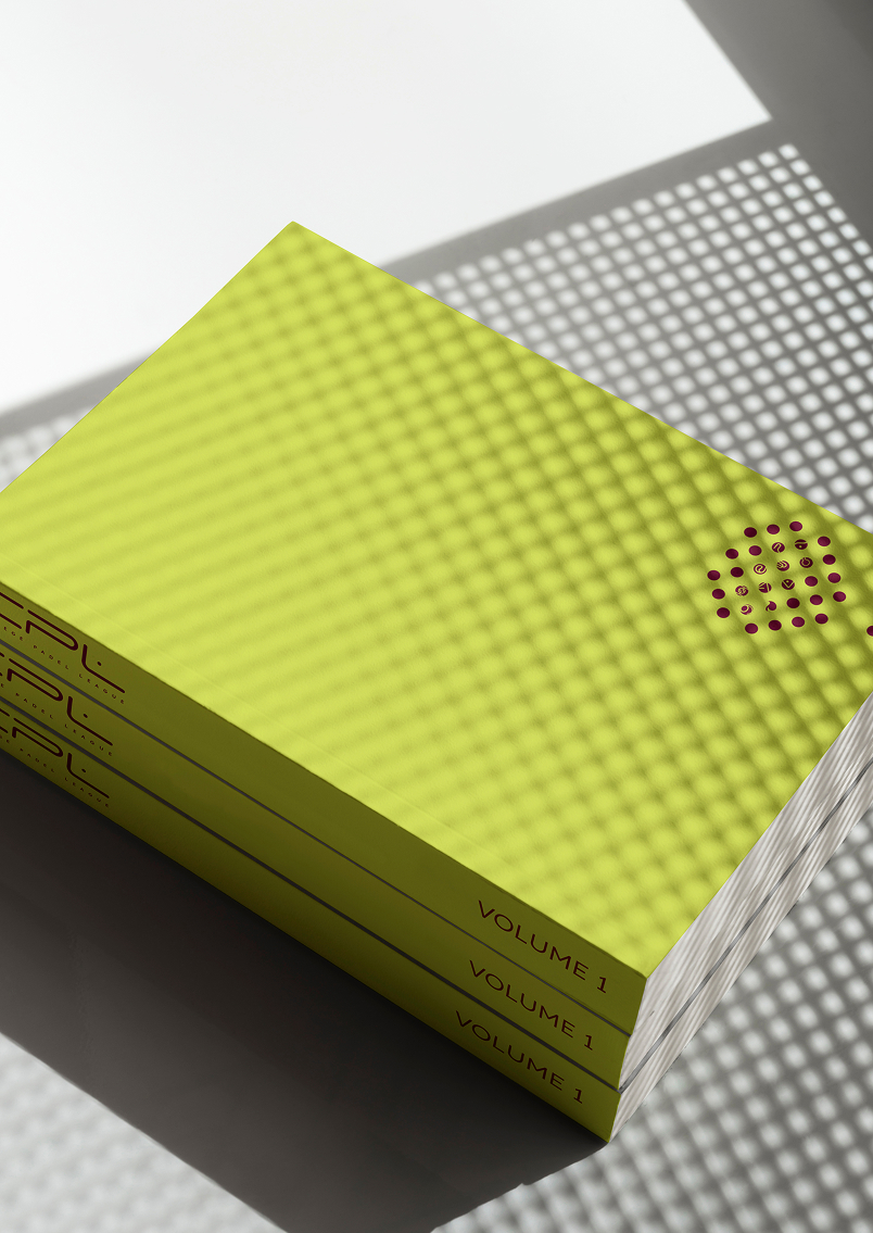
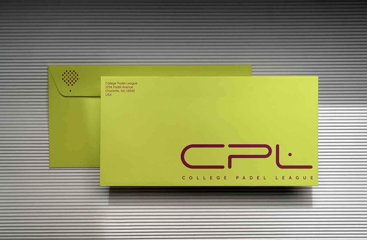
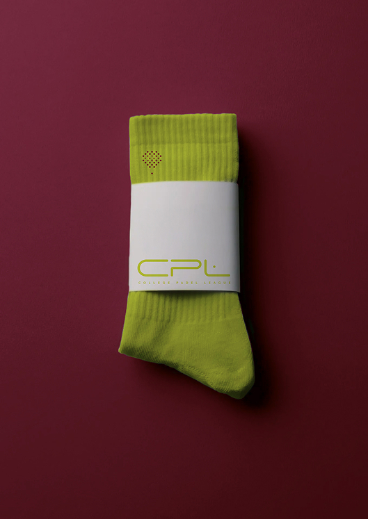
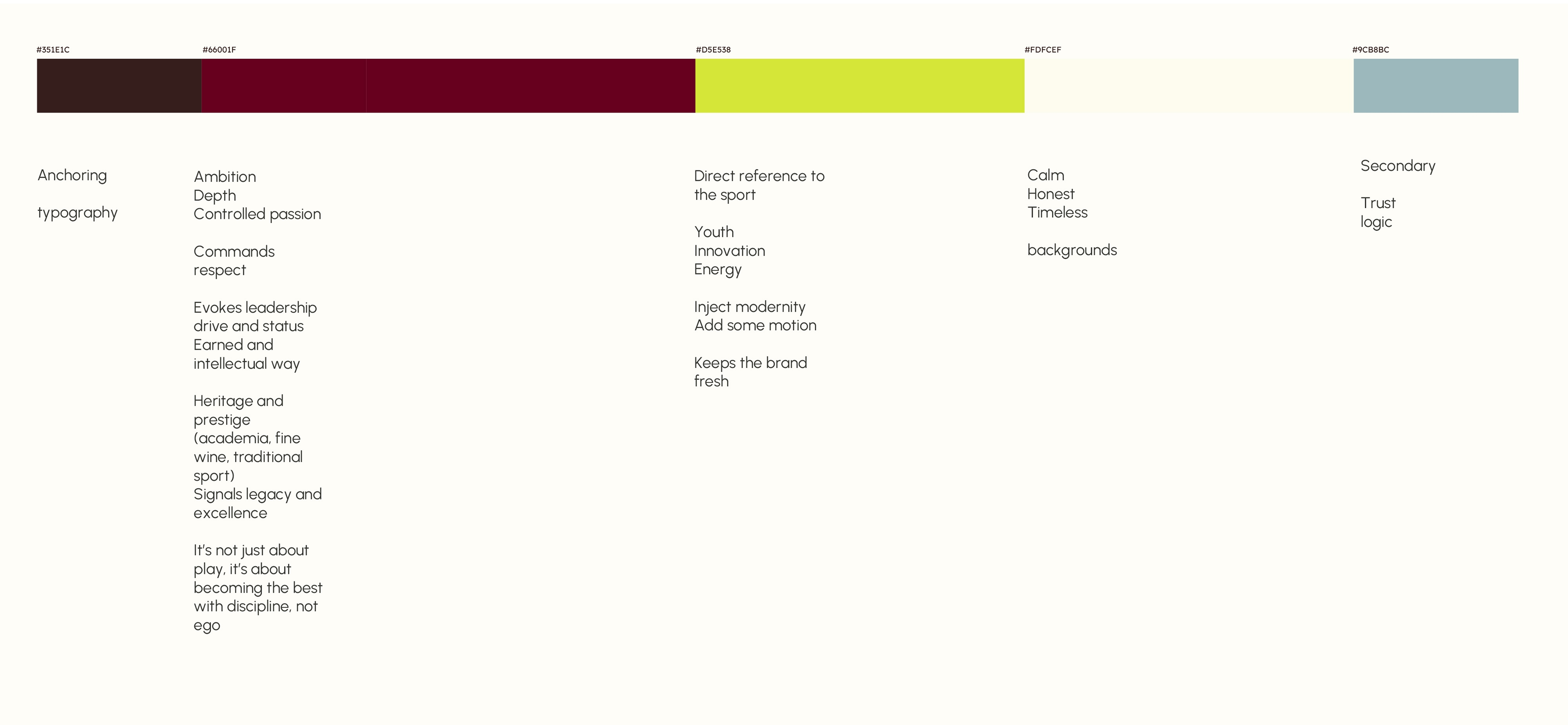
Deep burgundy forms the foundation, bringing the prestige, tradition and institutional character associated with collegiate athletics. Against it, fluorescent yellow is pulled directly from the padel ball, creating an immediate visual connection to the sport while injecting energy, visibility and a distinctly modern edge into the identity.
Warm off-white and muted supporting tones balance the intensity of the palette, allowing the fluorescent yellow to act as a recognisable signal throughout the brand.
Together, the colours create a system that feels rooted in collegiate heritage, but built for a new generation of padel.
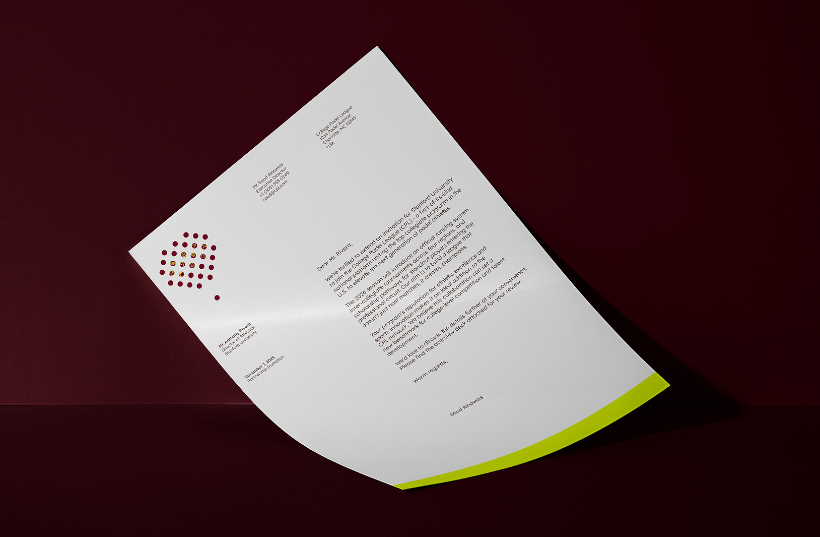
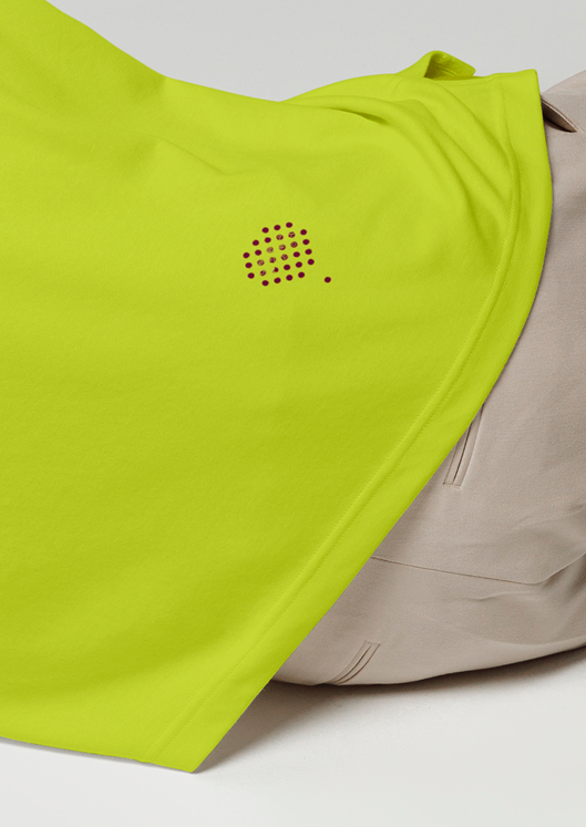
We therefore built the identity as a flexible system. In stakeholder presentations, business documents and institutional communications, it can become restrained, structured and authoritative. On court, across apparel, signage, social and broadcast, the same visual language can become bolder, faster and more expressive.
The consistency comes from the core ingredients; strong geometry, confident typography, a distinctive palette and the CPL icon, allowing the brand to shift its energy depending on the environment while remaining immediately recognisable. It gives CPL the credibility to exist in the boardroom and the performance to come alive on the court.