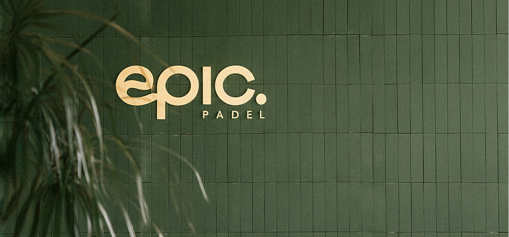
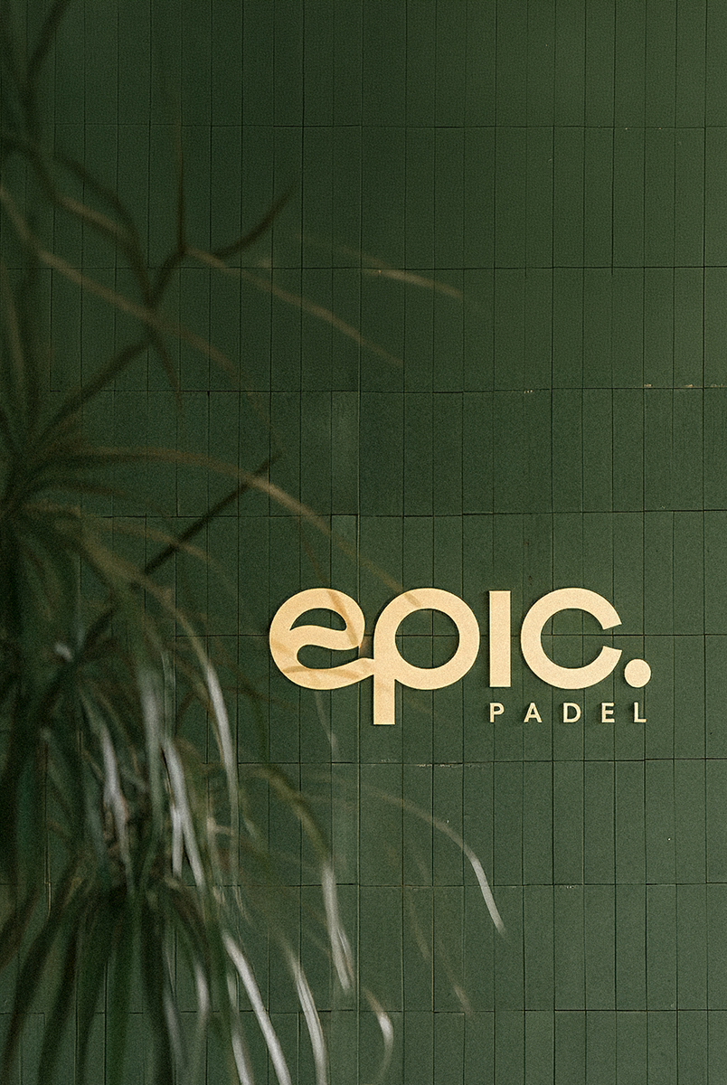
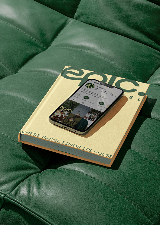
WHERE PADEL FINDS ITS PULSE
Refining a Brand to Shape the Future of Padel in the U.S.
Epic Padel approached F31 with an ambition beyond launching another padel club. The goal was to build a brand capable of shaping the future of padel in the U.S. One that could exist at the intersection of sport, design, lifestyle, and community.
In a rapidly growing category dominated by generic sports branding and transactional club experiences, Epic needed a distinct identity system that felt premium yet approachable, design-led yet energetic, and scalable across both physical and digital environments. The brand had to work seamlessly across venues, merchandise, apparel, social media, and future club expansions while creating a recognizable and emotionally engaging world around the sport.

F31 developed the Epic Padel brand around a central strategic idea: “Where Padel Finds Its Pulse.”
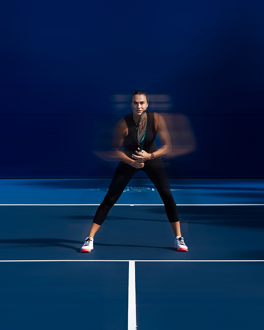
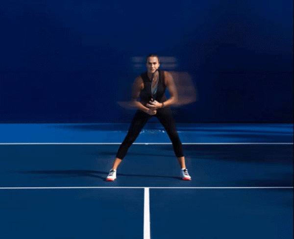
Rather than positioning Epic purely as a series of sports venue, we built the brand as a cultural platform for the modern padel community. Every element of the identity system was designed to capture the rhythm, movement, warmth, and social energy that surrounds the sport today.
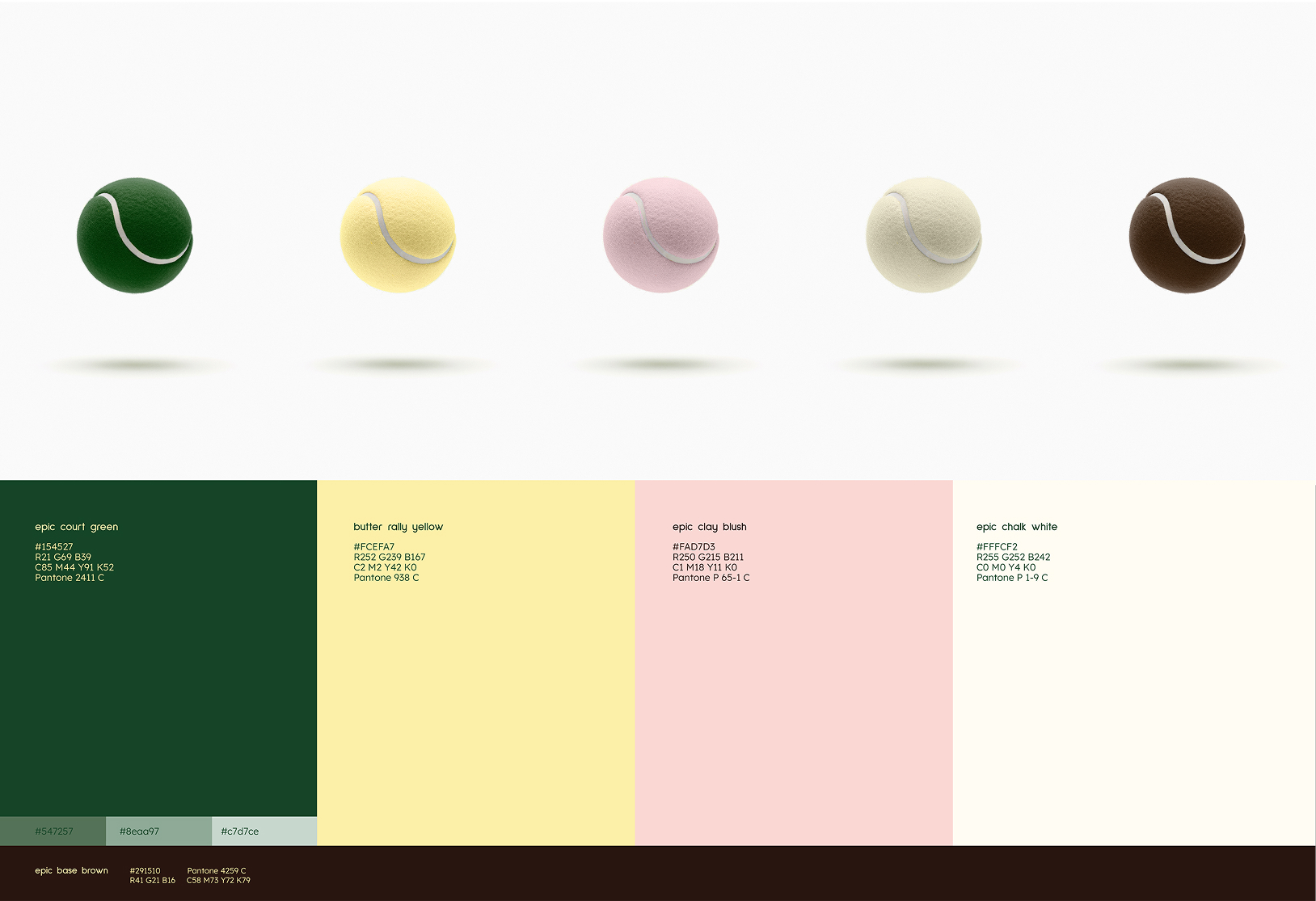
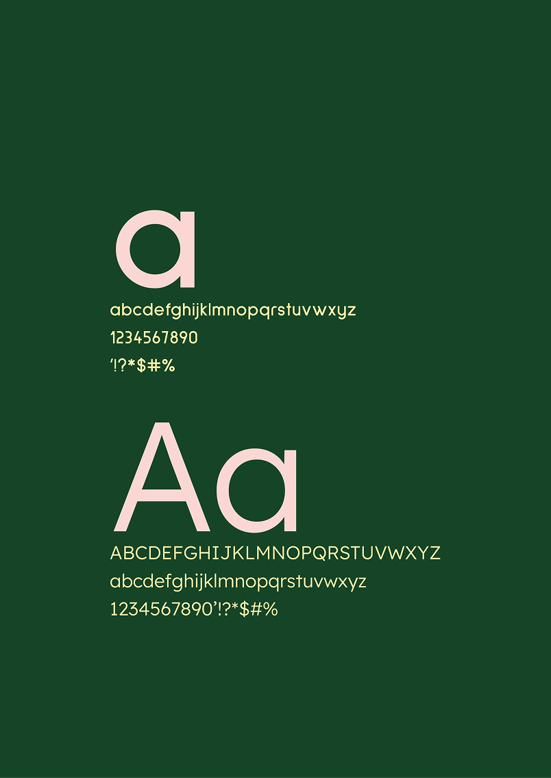
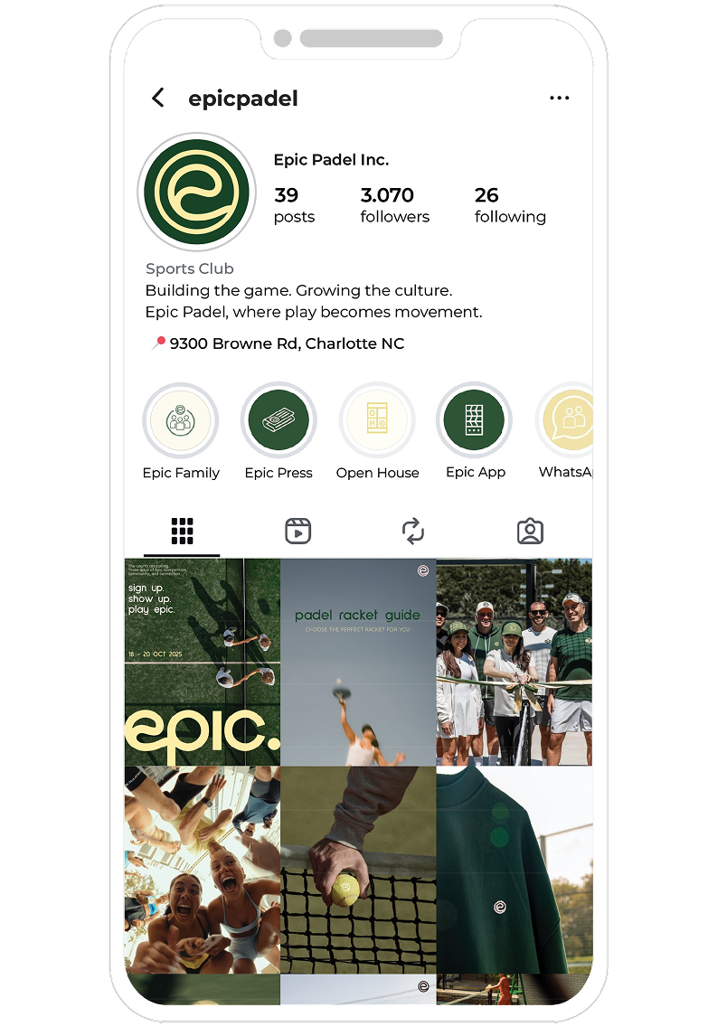
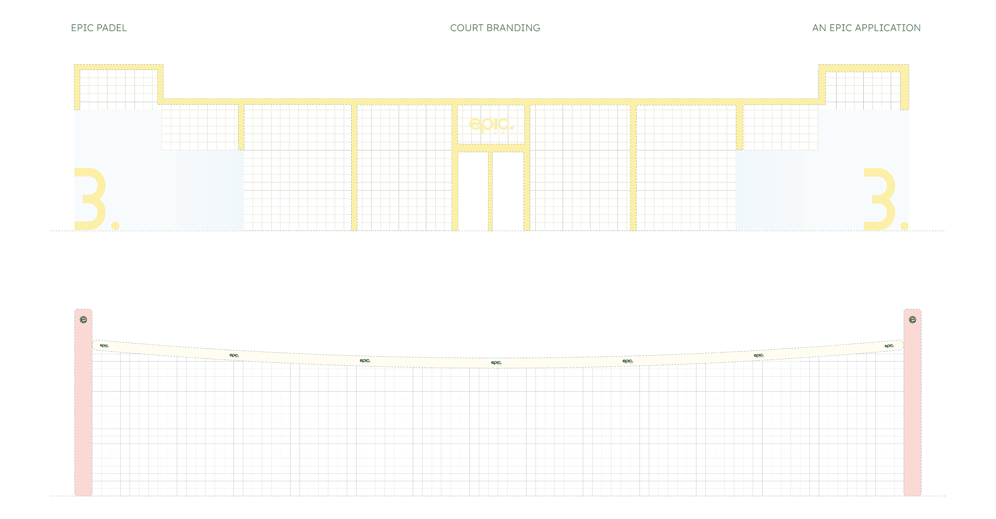
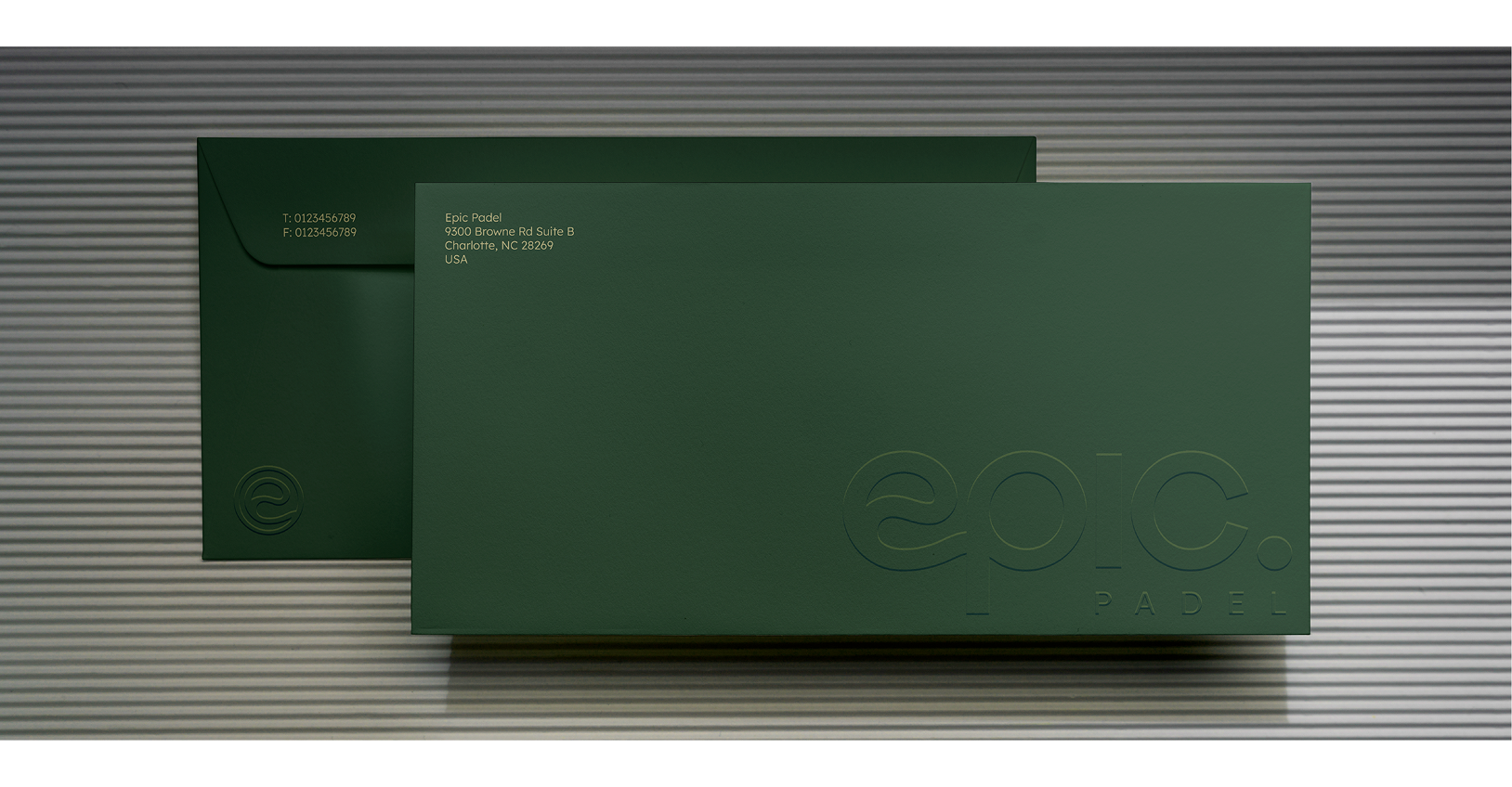
We created a full visual and verbal identity system spanning brand strategy, positioning, logo architecture, typography, color palette, tone of voice, photography direction, motion language, court branding, signage systems, social media applications, and web design.